Superellipse: Turning a Circle into a Square
By Peace Foo 胡適之

“In the whole pattern of civilisation there have been two tendencies, one toward straight lines and rectangular patterns and one toward circular lines. There are reasons, mechanical and psychological, for both tendencies. Things made with straight lines fit well together and save space. And we can move easily — physically or mentally — around things made with round lines. But we are in a straitjacket, having to accept one or the other, when often some intermediate form would be better.” — Piet Hein [1]
Draw a line, any line, and it will have to be either straight or curved. Extend a curved line far enough and it closes to become a circle. Cross two straight lines and you get a corner; straighten the corner and you get a right angle. “Straight vs. curved” is a very natural paradigm that shows up all around us, and from its beginning mathematics has been built on the study of their differences. Euclid’s Elements, the most famous geometry textbook of all time, begins with the assumption that straight lines, right angles, and circles can always be drawn. The idea of translating these geometric shapes and problems into algebra, which was first described by Descartes only about a century after the beginning of algebra in its modern form, unified those two main areas of mathematics. It is the reason we still learn about Cartesian graphs (graphs drawn with the coordinate system that we are all familiar with) in school.
On the usual x-y plane, the equation for a straight line is familiar: y = mx + c. Linear equations, where the highest-order term is x or y, always produce straight lines. Quadratic equations, with x2 or y2, will produce one of the curved conic sections – circles, ellipses, parabolas, or hyperbolas [1]. Consider x2/a2 + y2/b2 = 1, the general equation for the ellipse, which becomes the equation for a circle when a = b: the equation x2 + y2 = 1 should look familiar. By 1818, all this was well known to mathematicians. In a geometry book published that year, Gabriel Lamé decided to take things further by thinking about what happens with exponents n other than 2 [2].
The generalized curve xn + yn = 1 comes in many varieties depending on n [3], but the most interesting one for us is what happens when n is a fraction p/q, with p even, and q odd and greater than 1. These fractions for n include all the even integers 2, 4, 6, 8, …
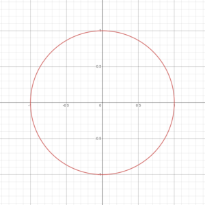
From the circle at n = 2, you can see the shape become progressively closer to a square as n increases through the even integers (Figure 1). By adding absolute values, we allow n to be any number; now the Lamé curve |x|n + |y|n = 1 varies continuously for all n > 2 from a circle at n = 2 to a square in the limit as n goes to infinity. So does the general Lamé curve |x/a|n + |y/b|n = 1, which turns into a rectangle instead when the same limit is taken. If you never knew the equation for a square or rectangle, congratulations! Now you do.
 |
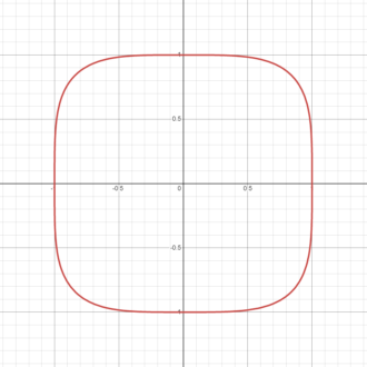 |
Figure 1 Transition of Lamé curves as n increases (n = 2 and n = 4 from left to right).
Thanks to the visual tool and shorthand provided by algebra, we have an intermediate shape between square and circle that can be described in a simple form. This simplicity is the reason for the sudden revival of this obscure curve in some unusual applications. Here are a few of them.
In 1959, Swedish architects wanted to build a roundabout that could fit into a rectangular space between the buildings of downtown Stockholm [4]. Roundabouts tend to be circles, of course, but a circle would leave part of the space unused. An ellipse has pointed ends that would be harder for traffic to navigate. The city planners also tried a combination of eight arcs, but that would create too many points where the curvature would suddenly change. A Danish designer and scientist, Piet Hein, came across this problem when it was announced as a design challenge, and leaned on his mathematical background to find a compromise shape between ellipse and rectangle. He came across the Lamé curve and experimented with the value of n for an ellipse of width 6 and height 5 (i.e. a = 6, b = 5), eventually deciding on n = 5/2 or 2.5 (Figure 2) [5], which he called a “superellipse”:
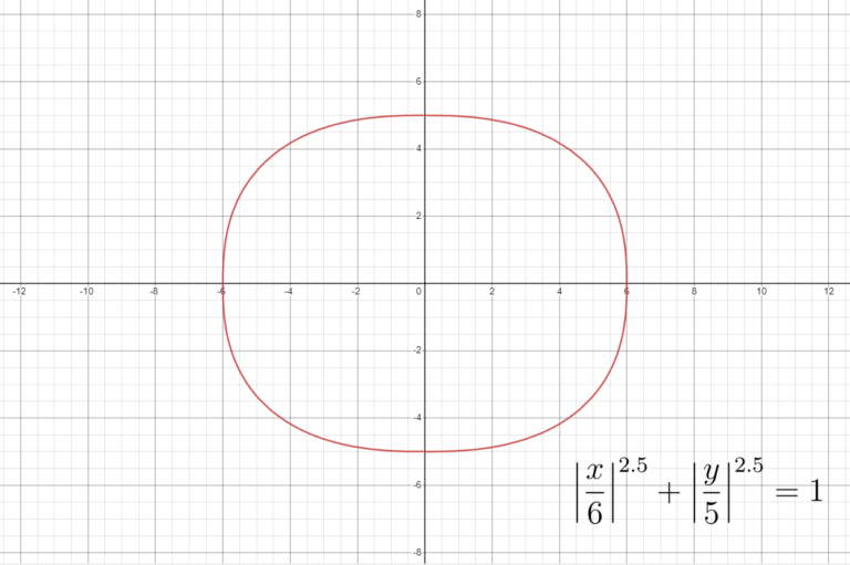
Figure 2 Piet Hein’s solution to the roundabout at Stockholm.
Piet Hein decided that this was the most beautiful shape possible for the roundabout. In an article he wrote afterward, he remarked that [1]:
“To draw something freehand — such as the patchwork traffic circle they [other architects] tried in Stockholm — will not do. It isn’t fixed, isn’t definite like a circle or square. You don’t know what it is. It isn’t aesthetically satisfying. The super-ellipse solved the problem. It is neither round nor rectangular, but in between. Yet it is fixed, it is definite — it has a unity.”
Between iOS 6 and iOS 7, the design team at Apple also decided to make use of this satisfying aesthetic. Up until then the shapes of the app icons in iOS had been squares with rounded corners (Figure 3) [6]. This is a problem for the same reason as the Stockholm roundabout: The transition from straight line to tightly curved circle is visually jarring even if we don’t notice it consciously.
So, Apple’s designers based their new app icons on the Lamé curve. They adopted the curve where n = 26/5 or 5.2 with slight modifications [7], which results in a shape that has a smooth flow that is meant to feel more natural. (Note that the four sides of a superellipse are not straight lines, but curves, even if n equals to a relatively large number like 5.2.)
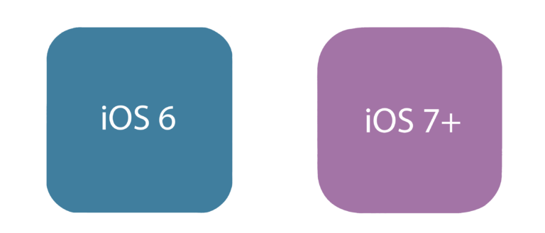
Figure 3 App icons in iOS 6 (square with rounded corners) and iOS 7+ (modified superellipse).
Xiaomi may have thought along the same lines. In 2021, the electronics company also changed its logo from a rounded square to an obvious Lamé curve (Figure 4).
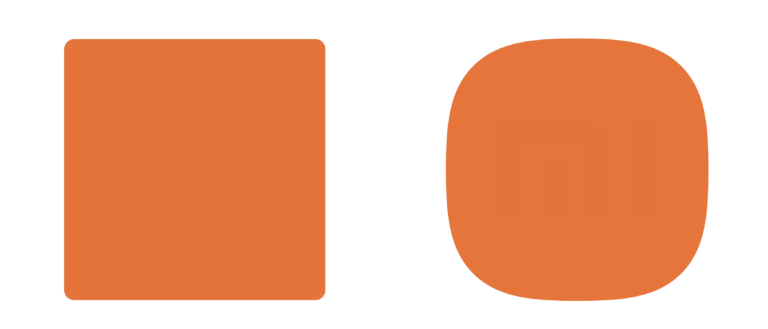
Figure 4 Shapes of the previous (left) and new (right) logos of Xiaomi.
Kenya Hara, the leading Japanese designer who oversaw the initiative, went through the same process as Piet Hein did and decided that n = 3 would look the most aesthetic [8]. But Piet Hein did something that Xiaomi didn’t. Piet Hein had a definite purpose in mind when he chose the superellipse. On the other hand, Xiaomi reportedly paid Hara two million yuan to change the shape of the logo and almost nothing else; the consensus on the Internet was that there was no real purpose to the redesign [9]. Xiaomi already had an iconic logo. Did the redesign really have a purpose? The answer was affirmative according to Hara; the new logo was said to be “an encapsulation of Xiaomi’s inner spirit” and “essentially a reflection of the concept ‘Alive [8].’”
The Lamé curve strikes a balance between straight and curved, useful tool and purposeless curiosity. So does much of mathematics – it may be hiding out of sight; it may take 200 years to find an application; it may occasionally be mocked on the Internet, but somehow it is there, if you know where to look.
References:
[1] Bellos, A. (2010). Alex’s Adventures in Numberland. Bloomsbury.
[2] Lamé, G. (1818). Examen des différentes méthodes employées pour résoudre les problèmes de géométrie [Examination of the different methods to solve geometry problems]. Vve Courcier. https://gallica.bnf.fr/ark:/12148/bpt6k92728m/f119.item
[3] Jaklič, A., Leonardis, A., & Solina, F. (2000). Segmentation and Recovery of Superquadrics. Springer.
[4] Gardner, M. (1965). The superellipse: a curve that lies between the ellipse and the rectangle. Scientific American, 213(3), 222-238. https://www.jstor.org/stable/10.2307/24931123
[5] Gridgeman, N. T. (1970). Lamé Ovals. Mathematical Gazette, 54(387), 31-37. https://doi.org/10.2307/3613154
[6] Mynttinen, I. (2020, October 18). The iOS Design Guidelines. https://ivomynttinen.com/blog/ios-design-guidelines
[7] Rosenfeld, L. (2021, October 12). My quest for the Apple icon shape. https://liamrosenfeld.com/posts/apple_icon_quest/
[8] Vincent, J. (2021, March 30). Xiaomi’s new logo is almost unrecognizable. The Verge. https://www.theverge.com/tech/2021/3/30/22358033/xiaomi-new-logo-design-square-round
[9] Shen, X. (2021, April 2). Xiaomi’s new ‘squircle’ logo becomes the butt of online jokes with many claiming they could have made it for much less money. South China Morning Post. https://www.scmp.com/tech/big-tech/article/3127984/xiaomis-new-squircle-logo-becomes-butt-online-jokes-many-claiming